In design, grids are more than just intersecting lines on a canvas or screen. They are fundamental tools that bring structure, organization, and precision to layouts, whether in print or digital media. A grid system provides a the framework for arranging elements on a page or screen.
Definition and Importance
A grid can be defined as a visual framework composed of intersecting horizontal and vertical lines that guide the placement of elements within a design. Grids provide a method for organizing content with consistency and efficiency. They serve as a guide for alignment, spacing, and proportion, enabling designers to create visually appealing and functional layouts.
Types of Grids
There are several types of grids commonly used in design:
Column Grid: This type divides the layout into vertical columns, with elements aligned to these columns. It offers flexibility in adapting to different screen sizes and orientations, making it suitable for responsive web design.
Modular Grid: Extending the column grid, the modular grid adds rows to create modules where elements are placed. This approach is beneficial for organizing content in a structured and repeatable manner, often used in e-commerce and listing pages.
Hierarchical Grid: Content is organized based on importance, with larger portions of the grid allocated to more significant elements. This type of grid is commonly seen in news websites or editorial layouts, where primary stories take precedence over secondary content.
Examples of Grids in Action
Let's take a look at some examples of grids in use:
Column Grid Example
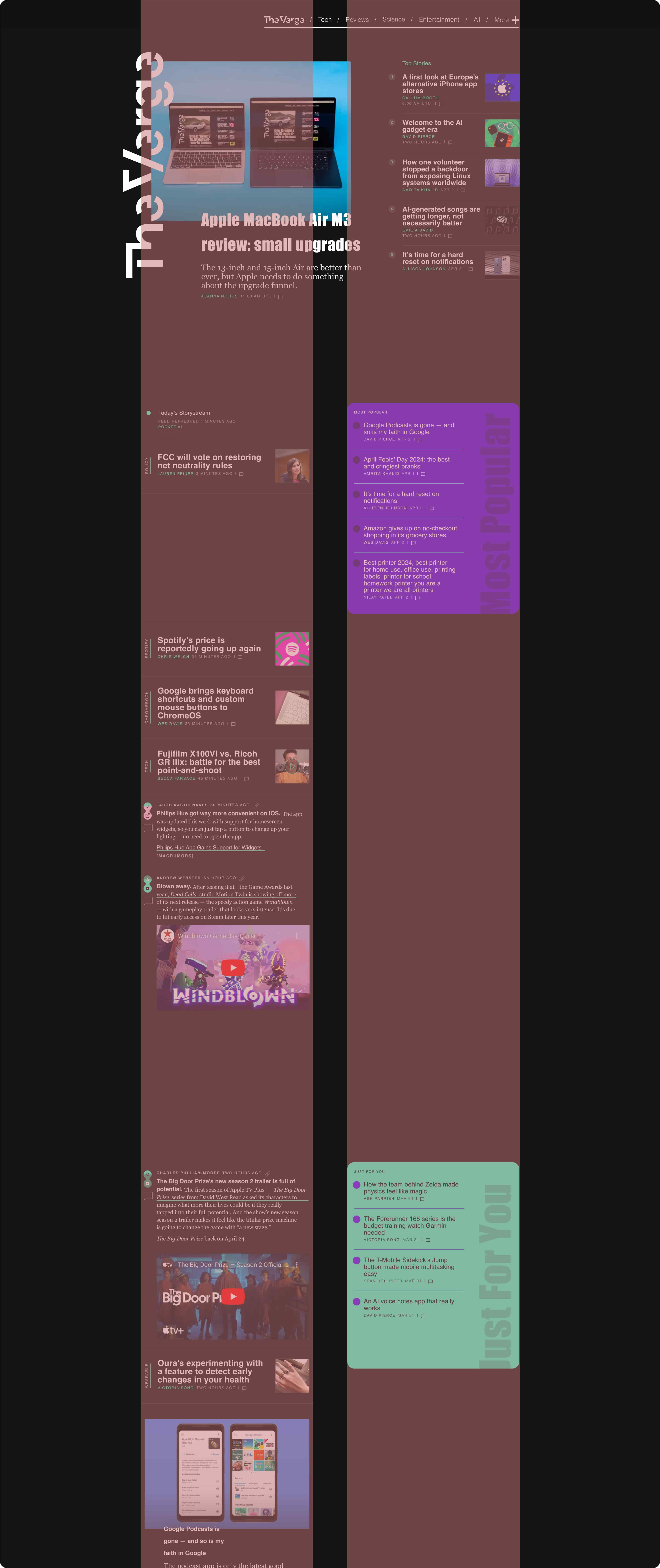
Website: The Verge
Description: The Verge uses a column grid layout for its articles and news sections. On desktop screens, the layout consists of 2 columns where articles and some categories are aligned. The main content occupies the left columns, while side menus are placed on the right. This column grid ensures a structured and organized presentation of content, making it easy for users to navigate through articles and related information.

Modular Grid Example
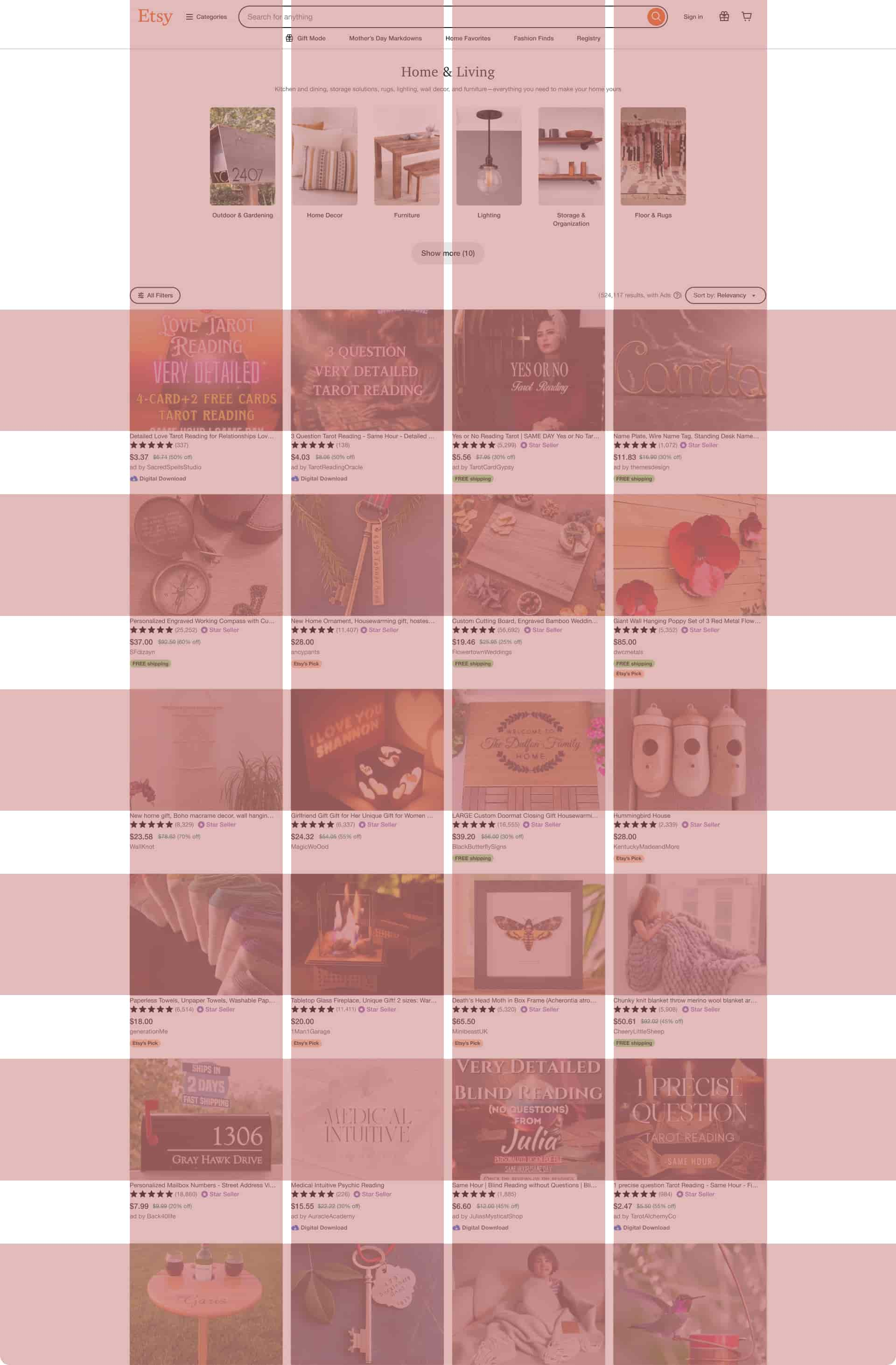
Website : Etsy
Description: Etsy utilizes a modular grid layout for its product listings and search results. Each product listing is presented within a consistent module, with standardized dimensions and spacing between items. Rows of product modules are arranged in a grid format, allowing users to browse through listings in a visually cohesive manner. This modular grid design facilitates easy comparison of products and enhances the overall shopping experience on the platform.

Hierarchical Grid Example
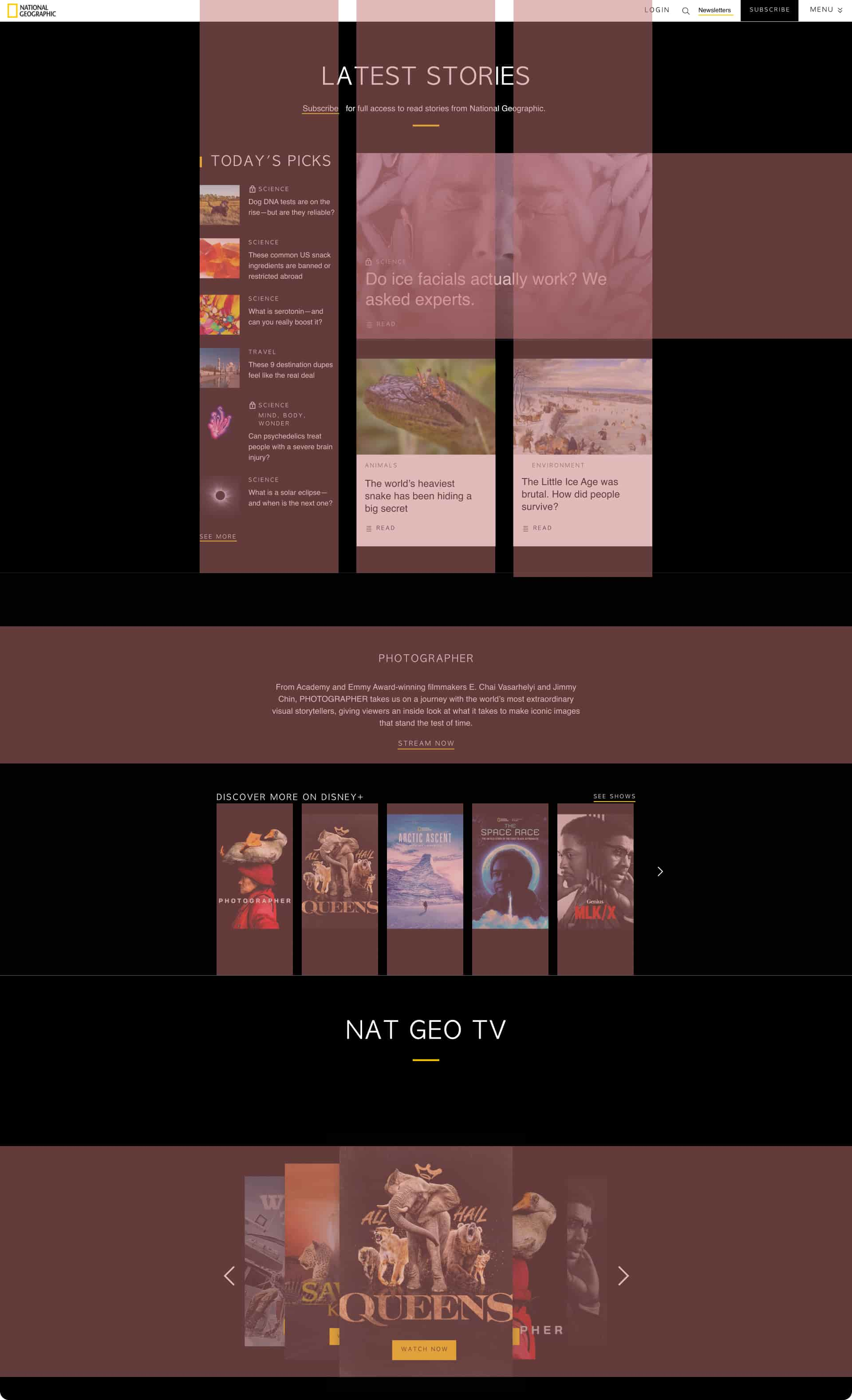
Website: National Geographic
Description: National Geographic's website uses a hierarchical grid layout. The homepage features a large, visually captivating image or video as the main focal point, highlighting significant stories or expeditions. Secondary content sections are organized into smaller grids. Each category may include articles, photo galleries, and videos, arranged based on importance and relevance. This design allows users to explore various topics while prioritizing key stories and visuals, reflecting National Geographic's commitment to storytelling and exploration.

Benefits of Using Grids
For both designers and users, grids offer numerous advantages:
Designers can create well-aligned interfaces efficiently, ensuring consistency and coherence in their designs.
Users benefit from easily scannable and predictable layouts, enhancing readability and navigation.
Grids are essential components of responsive web design, allowing designs to adapt seamlessly to various screen sizes and orientations.
Conclusion
In conclusion, grids are indispensable tools in the designer's toolkit, providing structure, organization, and flexibility in creating visually appealing and user-friendly layouts. Whether employed in print or digital media, the power of grids lies in their ability to streamline the design process and enhance the user experience.

