That’s fascinating how designs can tell their own exciting stories based on where they come from, as an example, let’s have a precise look at Chinese and European designs. Every click and swipe is a peek into centuries of culture, innovation, and history. I see it as a trip across continents to explore how these regions use technology to express themselves in unique ways. Through real-life examples, we'll notice how tradition and future dreams blend into their digital designs.
The Cultural Context
Chinese UI/UX: A Symphony of Complexity and Integration
Chinese digital platforms are renowned for their highly integrated and feature-rich interfaces. Apps like WeChat and Alipay are not merely messaging or payment apps; they are ecosystems that offer a multitude of services, from social media and e-commerce to public services and financial products. This complexity reflects the Chinese cultural preference for holistic solutions and community-oriented spaces.
Example: WeChat's interface allows users to book taxis, order food, make payments, and even schedule doctor's appointments, all within a single app. This "super app" concept is a direct reflection of the Chinese market's preference for multifunctionality and convenience.

European UI/UX: Clarity and Minimalism
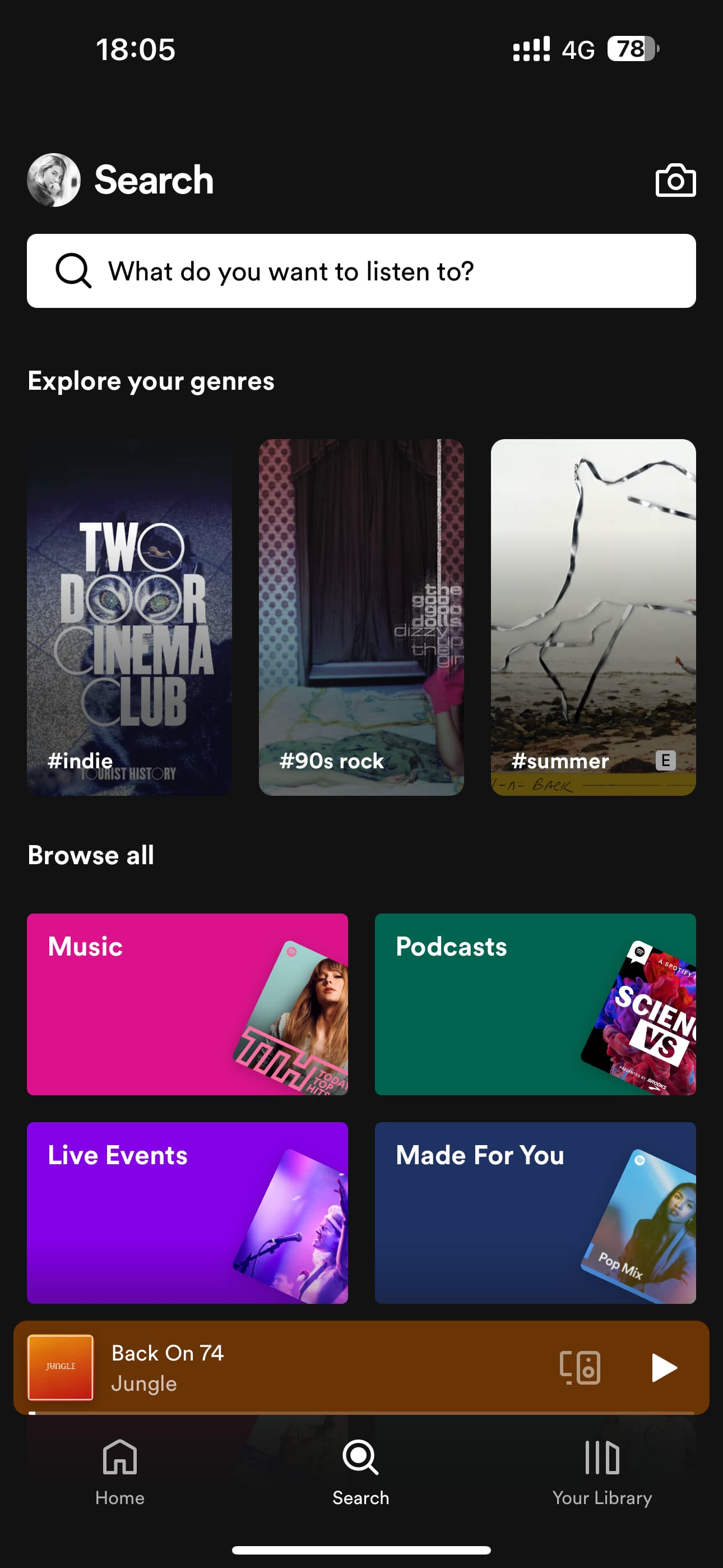
In contrast, European UI/UX design often emphasizes clarity, simplicity, and minimalism, reflecting a cultural inclination towards individuality and directness. European apps tend to focus on doing one thing well, providing a clean and intuitive user experience that makes it easy for users to accomplish their goals without unnecessary distractions.
Example: Spotify, a European-born app, showcases this approach with its clean interface, straightforward navigation, and focus on personalizing the music listening experience for each user, emphasizing the individual's choice and a clutter-free environment.

Historical Influences
The Legacy of Writing Systems
The complexity of the Chinese language, with its 50,000 characters and the importance of calligraphy, has influenced the design of Chinese digital interfaces. The need to accommodate complex characters and make them legible has led to a more flexible approach to layout and information density.
Chinese websites and apps often feature a higher information density compared to their Western counterparts, partly to accommodate the intricacy of the script.
The European Design Tradition
Europe's rich history in art, design, and typography has deeply influenced its UI/UX design principles. The European design ethos, with its roots in movements such as Bauhaus and Swiss Design, emphasizes cleanliness, readability, and the efficient use of space.
The use of whitespace, a hallmark of European design, not only enhances readability but also aligns with the European aesthetic of simplicity and elegance.
Technological Trajectories
The technological adoption paths of China and Europe have also played a significant role in shaping UI/UX designs. China's leapfrogging over traditional PCs to mobile internet usage has influenced the development of mobile-first and mobile-only applications. In contrast, Europe's gradual transition from desktop to mobile internet usage has resulted in a more conservative approach to mobile UI/UX design, with a stronger emphasis on adapting existing desktop designs to mobile platforms.
Conclusion
The differences between Chinese and European UI/UX designs are a reflection of each culture's values, history, and technological evolution. From the holistic, feature-rich ecosystems in China to the minimalist, function-focused designs in Europe, these digital interfaces tell a story of diversity and innovation. Understanding these differences not only enriches our appreciation of global digital cultures but also highlights the importance of cultural context in designing user experiences that resonate with local users. As the digital world continues to evolve, the interplay between culture, history, and technology will undoubtedly continue to shape the future of UI/UX design.

